Chapter 27 - When UX Eats Revenue
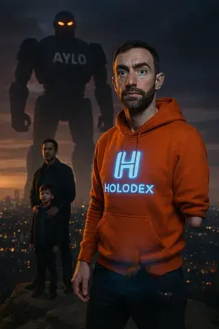
After we launched Holodex, the site gained traction faster than I’d ever anticipated. By the time we rolled out the second version, it was clear we were onto something special. This wasn’t just a functional update; it was a reinvention. The design, for its time, was nothing short of groundbreaking.
The interface was over-engineered in the best way possible—every detail meticulously thought out, every feature carefully crafted. Navigating the site felt like an experience in itself, as if the platform was alive and responsive to the user’s needs. It wasn’t just practical; it was playful, intuitive, and endlessly rewarding.
Holodex stood out in a sea of generic, cookie-cutter designs. It was unique—dare I say, the most unique website interface ever designed. The kind of digital space where every click, every interaction, brought joy, and yet, it retained a level of sophistication that commanded respect.
Even now, I’m proud to say I have proof of its brilliance. Screenshots, old user feedback, design drafts—all of it stands as a testament to the thought and creativity we poured into it. Holodex wasn’t just a website; it was a statement. It set a bar that few others dared to reach for, and for a time, it was untouchable.
Looking back, I feel a profound sense of satisfaction knowing that something we built not only worked but thrived—and in doing so, left a mark on an industry that too often settles for mediocrity.
Despite the growing success of Holodex in terms of traffic, we were still making no money. The numbers were impressive—12 million page views in total—but there was a catch: we had no marketing budget. Every bit of growth came from sheer grit, resourcefulness, and relentless effort on my part. Getting the site off the ground was a monumental task, and while I was proud of the traction we’d achieved, the lack of financial return was a constant frustration.
One of the biggest issues was also, ironically, one of our greatest strengths: the interface. It was too good. Users loved it—so much so that they would absolutely cane it, racking up staggering page counts in single sessions. Some would hit 1,000 pages in one go, endlessly exploring, clicking, and revelling in the experience. While this level of engagement was a testament to the design’s brilliance, it was also bleeding us dry.
Each click, each page view, came with a cost, and without a way to effectively monetise the traffic, the site was draining resources rather than generating revenue. It was an exhilarating yet maddening paradox: we had created something exceptional, something users couldn’t get enough of, but we couldn’t turn that enthusiasm into profit.
Looking back, it was a harsh but invaluable lesson about the realities of running a site like Holodex. A beautiful, functional product wasn’t enough; without a solid monetisation strategy, all that traffic was just an expensive badge of honour.
Dave Monk

- Nationality: Welsh
- Ethnicity: Caucasian
- Eye Colour: Blue
- Hair Colour: Brown
- Tattoos: None
- Star Sign: Aries
- Bra Cup Size: n/a
- Date of Birth: 46 ( 05 th Apr 1979 )
- Weight: 60 kg